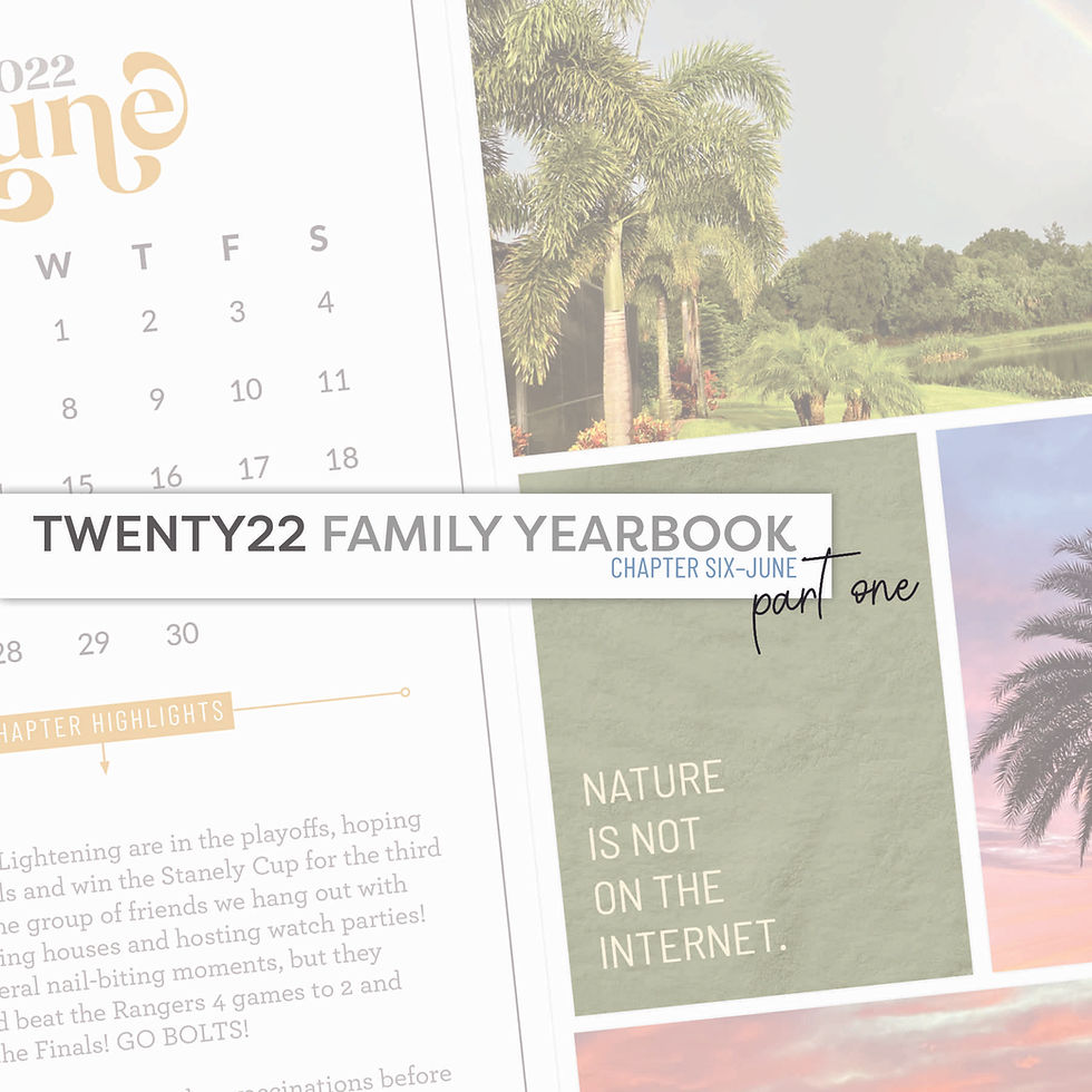
June was a very busy month for us. There was so much going on and it is taking me a while to combine my photos + stories for those thirty days. When I realized I was already up to 6 spreads for the month and still had 2 or more 3 to go, I figured I would share my June pages in two separate posts.
The pages were created on my iPad Pro using the following products and mobile apps:
The Project Life App
Affinity Photo for iPad
QR Code & Barcode Reader App
Grab a drink and get comfy! There is a lot to talk about here!
June Title Page

Title page was created by using the Design W template in the Project Life app. One of the title cards from the Chapters June Edition was placed in the center placeholder. Other placeholders were filled with the white card found in the Neutral Kit in the app. Shadows were turned off on this page.
Spread One

In the spread above you can see the 6x12 Calendar Card from the June Edition of the Chapters Collection. This is placed in the Big Shot A Template from the Project Life app and I will ALWAYS use this template on the left hand side of the first spread for each month. The filler card on the left page and the "good vibes only" journal card on the right side are from the June Edition of the Chapters Collection as well. That other journal card you see was created in the Small Prints section of the Project Life app using one of the textured papers from the June Edition of Chapters. I love that paper! Other products from my shop used on this spread included a template from the 3x4 Pocket Frame No. 1 Kit.
Spread Two

Pocket Frame Kits used on this spread are from the 4x6 Pocket Frames No. 2 Kit, 4x6 Pocket Frames No. 3 Kit, and the 3x4 Pocket Frames No. 2 Kit. All of the journal cards you see on the spread are ones I made using the Small Print section in the Project Life App with textured digital papers from the June Edition of Chapters. It is a very cohesive page because I am repeating the textures and colors of the journal cards on both sides of the spread!
Spread Three

I am ecstatic about this Buffalo Trace spread. Friends, pay attention to the little secret I am about share with you here. I have mentioned it in the past, in my December Daily albums, but I still don't think digital memory keepers take advantage of it as they should. I am talking about company Media Kits. A Media Kit, also called a Press Kit, is a set of promotional materials a company may offer to the media (reporters, bloggers, videographers) in order to help them write articles about the company. It can include things like logos, fonts, colors, branding do's and don'ts, high-resolution images, etc. If you document stories about some of your favorite brands, whether it is clothing, food, amusement parks, points of interest, and all the things in between, check that company's website to see if they have a media kit for you to download a logo or images that you can include on your pages.
Case in point: The logo you see on the 6x8 filler card in the spread above was a .png file downloaded directly from the Buffalo Trace website! I created the card in Affinity Photo for iPad and was able to place the logo right on the card. I exported the card to my camera roll, dropped it into my Project Life template, and then adding the journaling.
I did the same thing for the journal card on the right side of the page. There was a png of a single bottle of Buffalo Trace in their media kit. It's like a digital sticker! I created the card in Affinity Photo for iPad (used one of the textured papers from the June Edition of Chapters), pulled in the bottle of bourbon, and just duplicated it a few times! I love the way it turned out!
Let's talk QR Codes. See that one in the upper right corner of the right side of the spread? It's very subtle and not in your face. There is no white background you would normally see. I was able to achieve this in Affinity Photo for iPad by placing the QR code on the image and then changing the blending mode of the layer to "darken." I really like the way this looks! What do you think?
Spread Four

You may have noticed by now that Big Shot 7 Template is a favorite of mine. I like the 6x8 placeholder on it. It is a great space to do a lot of journaling in, saving the rest of the pockets for photos. This 6x8 journal card was created in Affinity Photo for iPad using a textured paper from the June Edition of Chapters. I made the title on the card in Affinity as well, but the journaling was done in the Project Life App. The "love is sweet" filler card was created in Affinity for iPad, too. This could have easily been done in the Project Life App, but I really wanted to have access to the glyphs of the font I used and couldn't access them in the PL App. The 3x4 journal card was created in the Small Prints section of the Project Life App using one of the textured papers from the June Edition of Chapters. The little heart swoosh is the Ding Dong Extras font I installed in the Project Life App.
Spread Five

Again, the journal cards were created in the Project Life app using a blue textured paper from the June Edition of Chapters. The filler card in the bottom left was done directly in the Project Life Template (Design A). I used the weather wood textured paper from the April Edition of Chapters (it coordinated with the stage at the brewery). Three text boxes were added by using the Free Form Text option in the app to add the words and dingbat heart. For the image in the 6x8 placeholder, I ended up manipulating one of the files from the 6x8 Pocket Frame No.3 Kit to make it work a little better for me here. It was done in Affinity Photo for iPad.
Spread Six

Last night on my Instagram feed I asked: "How do you get 17 photos, 3 journal cards, and one filler card in a double-page, pocket-style spread with 16 place holders?" It's by using POCKET FRAMES!!! Can you tell I am loving these Pocket Frame templates? I mean how else would I be able to get all of the photos you see on these pages to fit within one double-page spread??? You can't. They are so handy and a huge asset to have in my digital tool box! I am just over the moon with these. I'm so happy to be able to combine so many photos and stories on a double-page spread like this!
Have you given Pocket Frames a try? I have a freebie with two circle Pocket Frames for you to test on in this blog post. Give them a try! I know you are going to love them and want more!!! And when you do, check out all of the Pocket Frames available in the Pixels To Pages Shop!
That's it for Part One! I am finishing up the other layouts for June and will share them early next week, if not sooner! If you have any questions or comments, feel free to leave them below!!!
Comments